Category
Brand Design
Client
Bone.
Date
2023


The Brief
Bone is a roaming luxury restaurant concept based in the UK. No fixed address, no permanent menu. They travel across the country offering curated meat and fish focused dining experiences that change with every location. The brief was to build a brand that felt premium enough to match the experience but flexible enough to work across five distinct restaurant identities. This brief was a collaberation with a good friend of mine, Sofia, you can find her here: https://heptagon-ocelot-wng3.squarespace.com/


My Angle
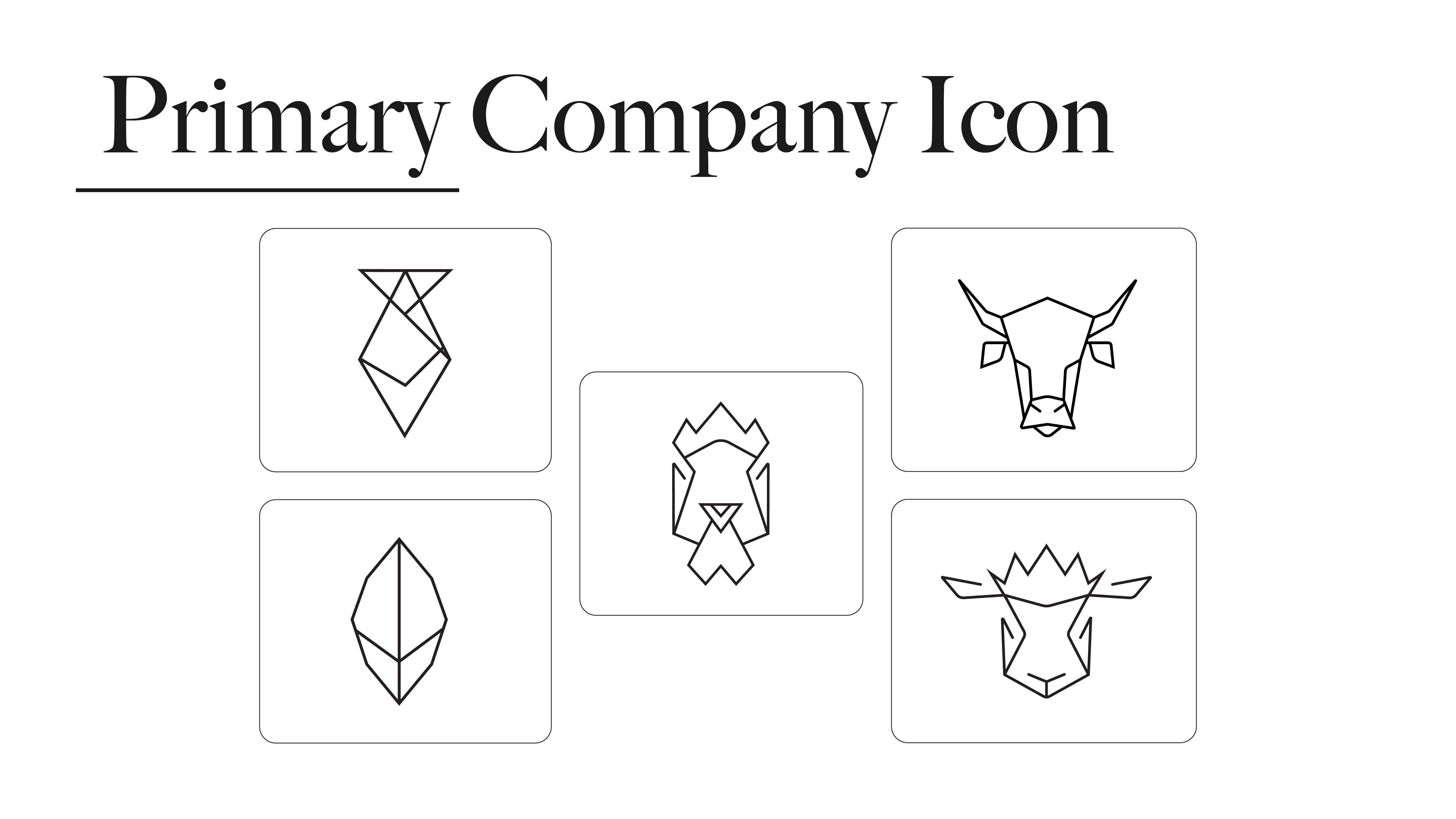
The B N E stacked logo with the O embedded was built in collaboration with Sofia, a brilliant designer who created the letterforms structure. My job was to make sure the icons earned their place next to her work. The geometric animal icons did some of the heavy lifting for the sub brands. Each one, beef, lamb, chicken, fish, and boneless, gets its own icon built in the same low poly line style so they all feel like siblings rather than strangers. Her type and my icons had to feel like they were always meant to be together, and in black and white with nothing else to hide behind, either it works or it doesn't... It works.
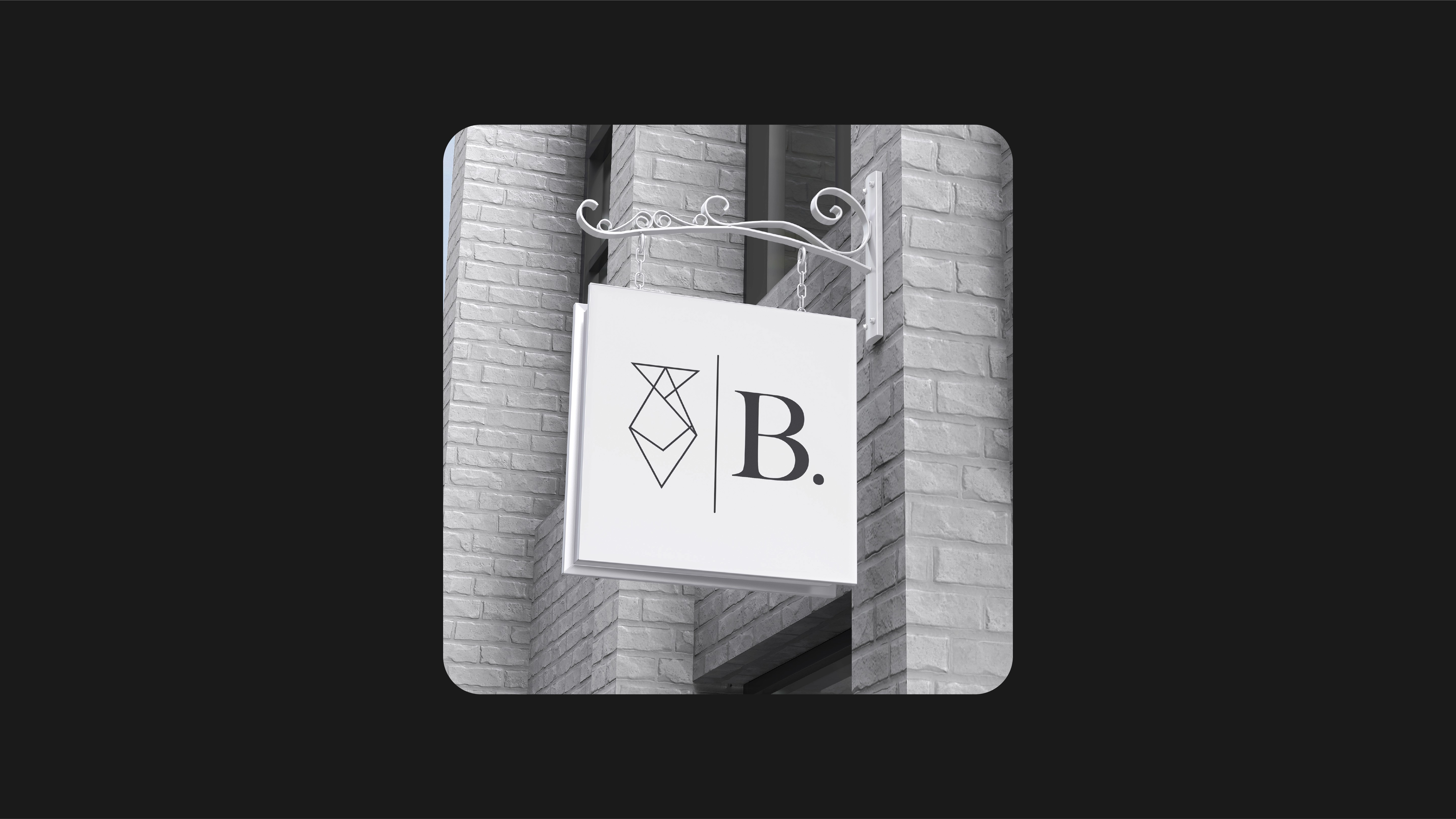
Real World Application


Outcome
Full brand system covering the primary logo, five restaurant sub brand logos, icon suite, and physical and digital mockups. A roaming restaurant that could walk into any city in the UK and immediately look the part. The system gives Bone the flexibility to change location and menu while the brand stays completely locked in.