Fisheye International Film Festival — Rebrand
A refresh for the festival's new name in its ninth year. Same fish, now with a laurel and a family of event logos.

The challenge
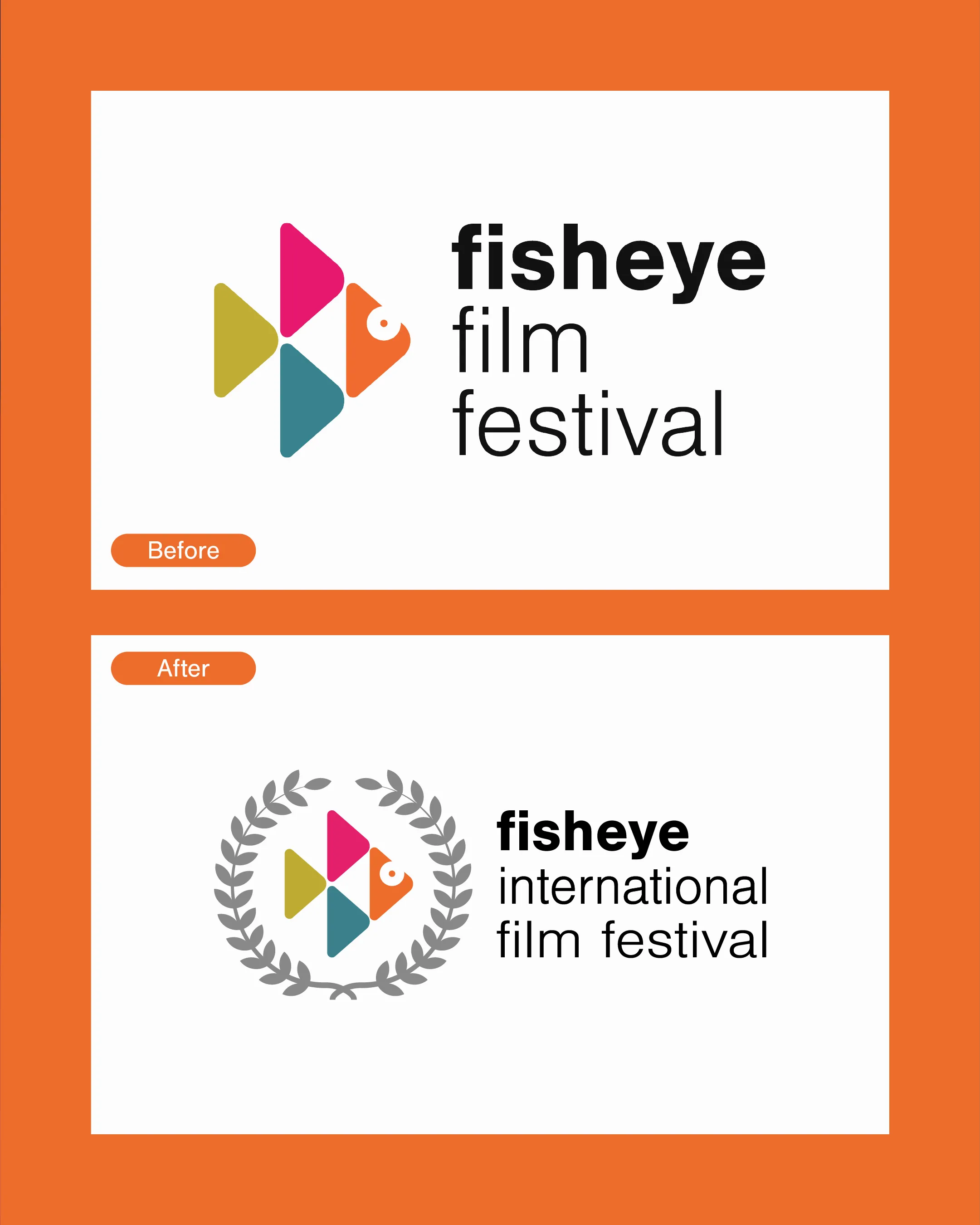
The festival was changing its name from Fisheye Film Festival to Fisheye International Film Festival. People already knew the fish, so starting again wasn't an option. It just needed to look at home next to the bigger festivals.
The solution
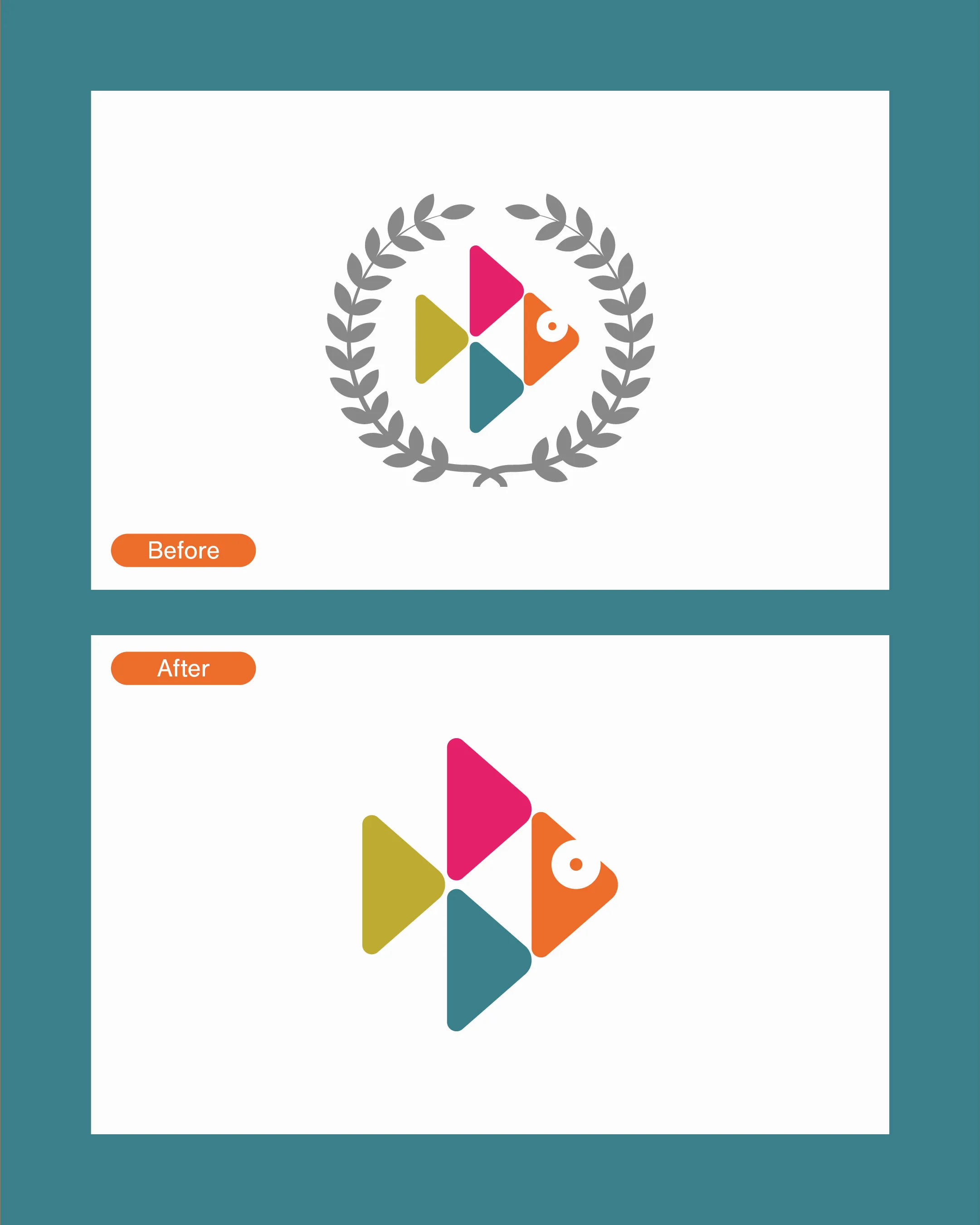
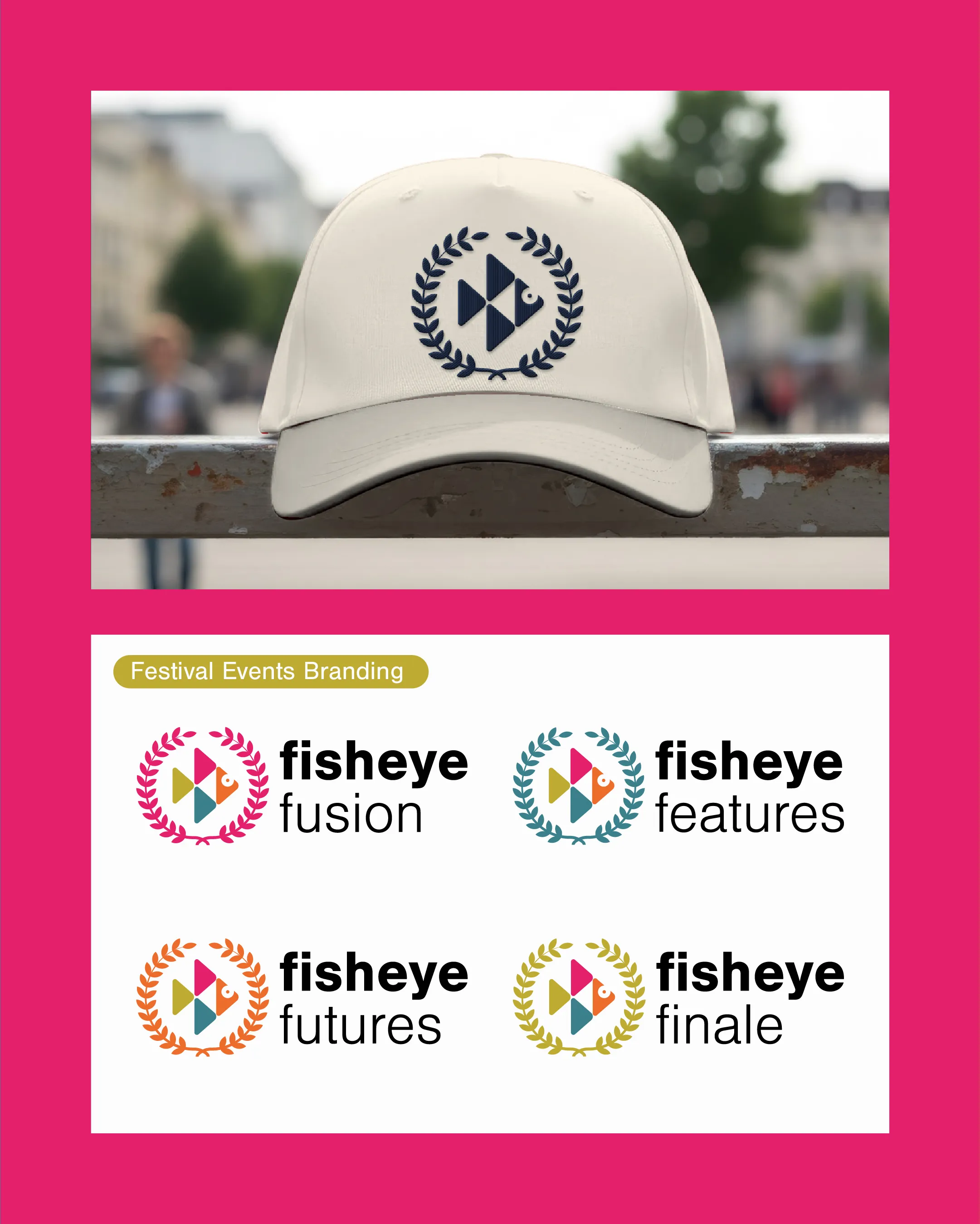
I kept the fish and its four colours and put it inside a laurel, the mark every film festival award uses. The fish still works on its own when space is tight. Each part of the festival got its own version, Fusion, Features, Futures and Finale, each in one of the fish's colours.
How I approached it
With a rebrand, most of the work is deciding what to keep. The fish was the bit people recognised, so that stayed. The laurel does the job the new name needed: it says “international festival” before you’ve read a word.
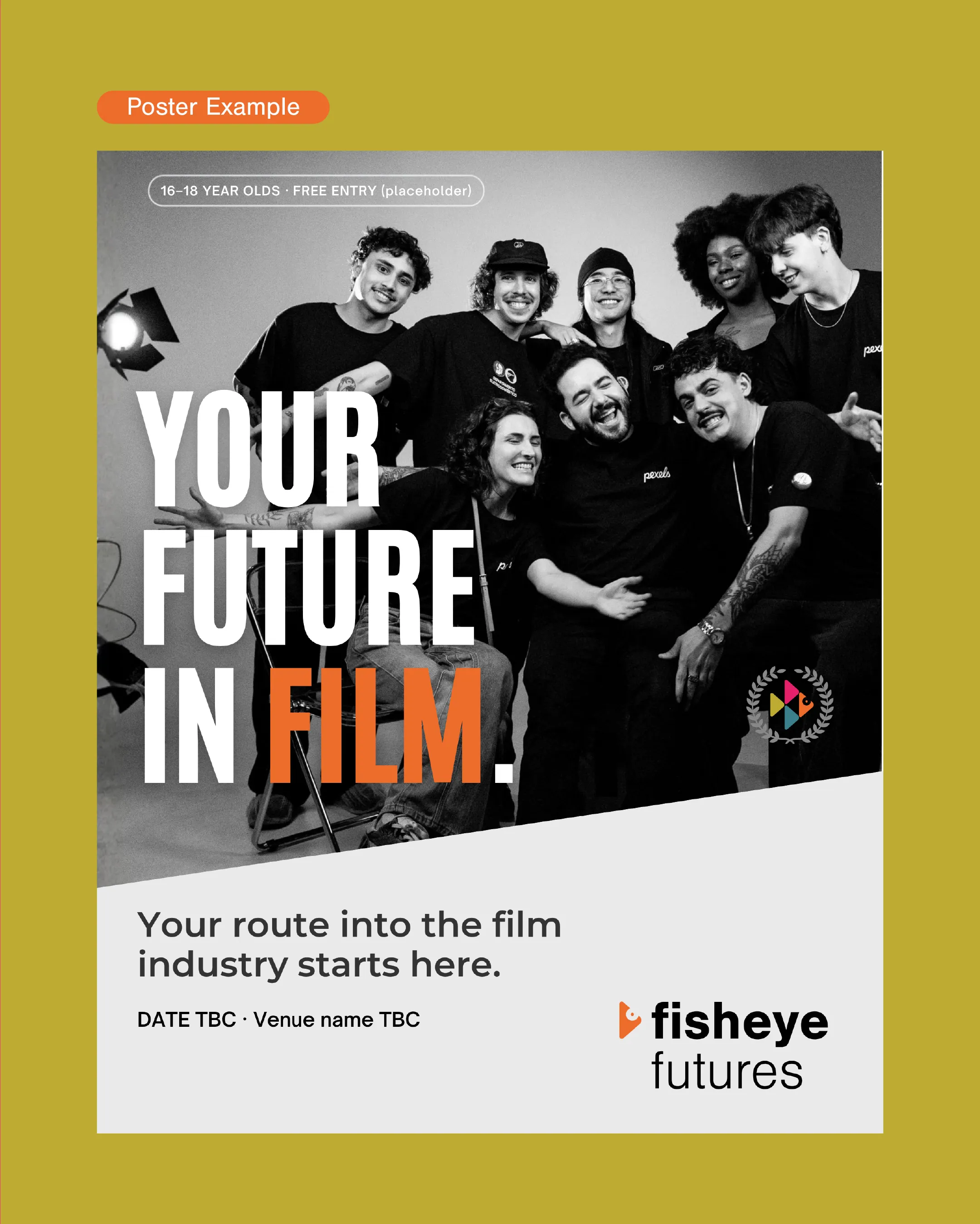
I also made a poster template for Fisheye Futures that the team can reuse every year. They swap the photo, the date and the venue, and it’s ready to print. The new logo is the one they use now.
Want work like this for your business?