Kilo — Health App
A concept brand, app and website for Kilo, a health app for people who have too many apps.

The challenge
Most people track calories in one app, workouts in another and their vitamins in a notes app. Kilo puts it all in one place, so the brand had to feel simple and calm, not like another fitness app shouting at you.
The solution
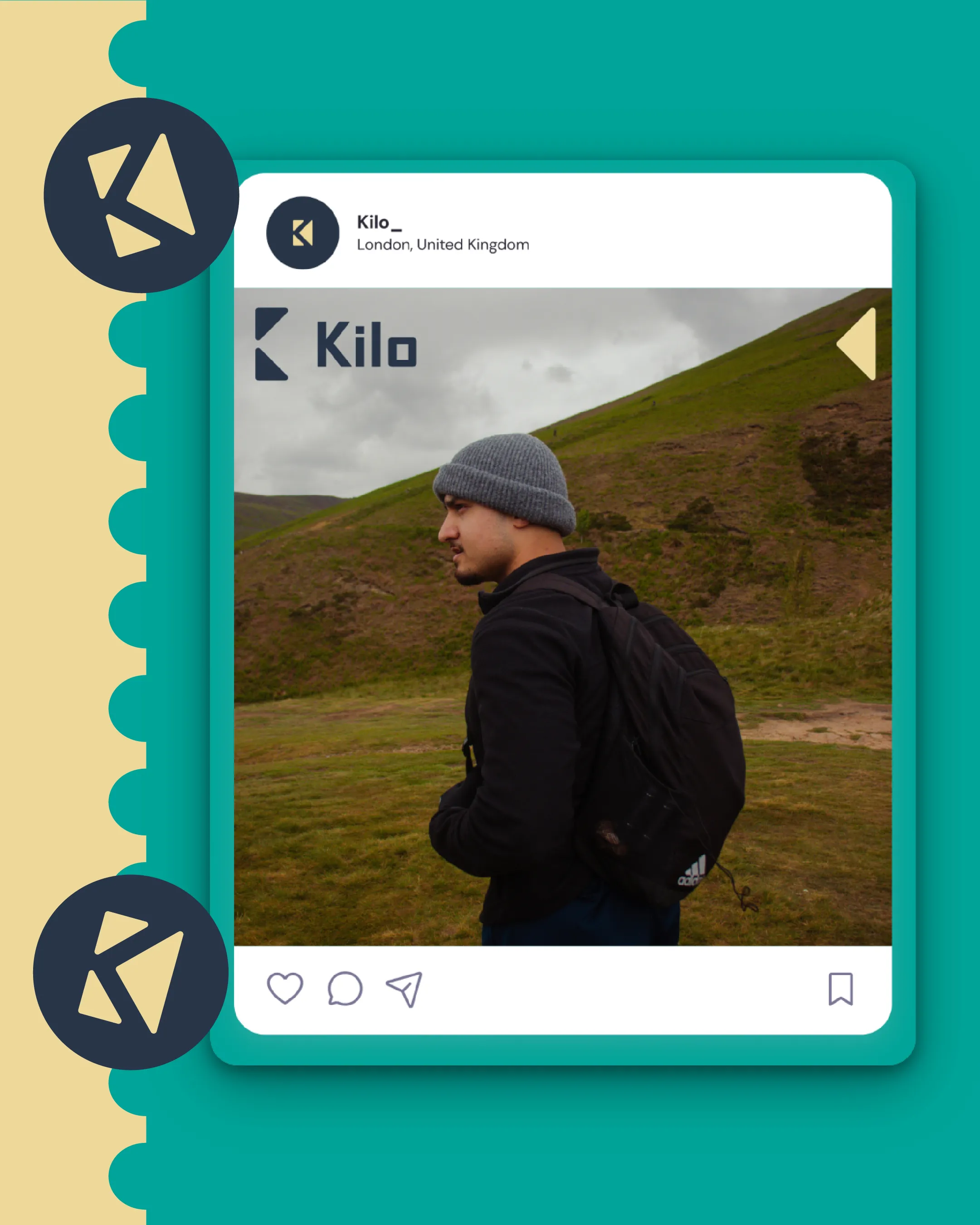
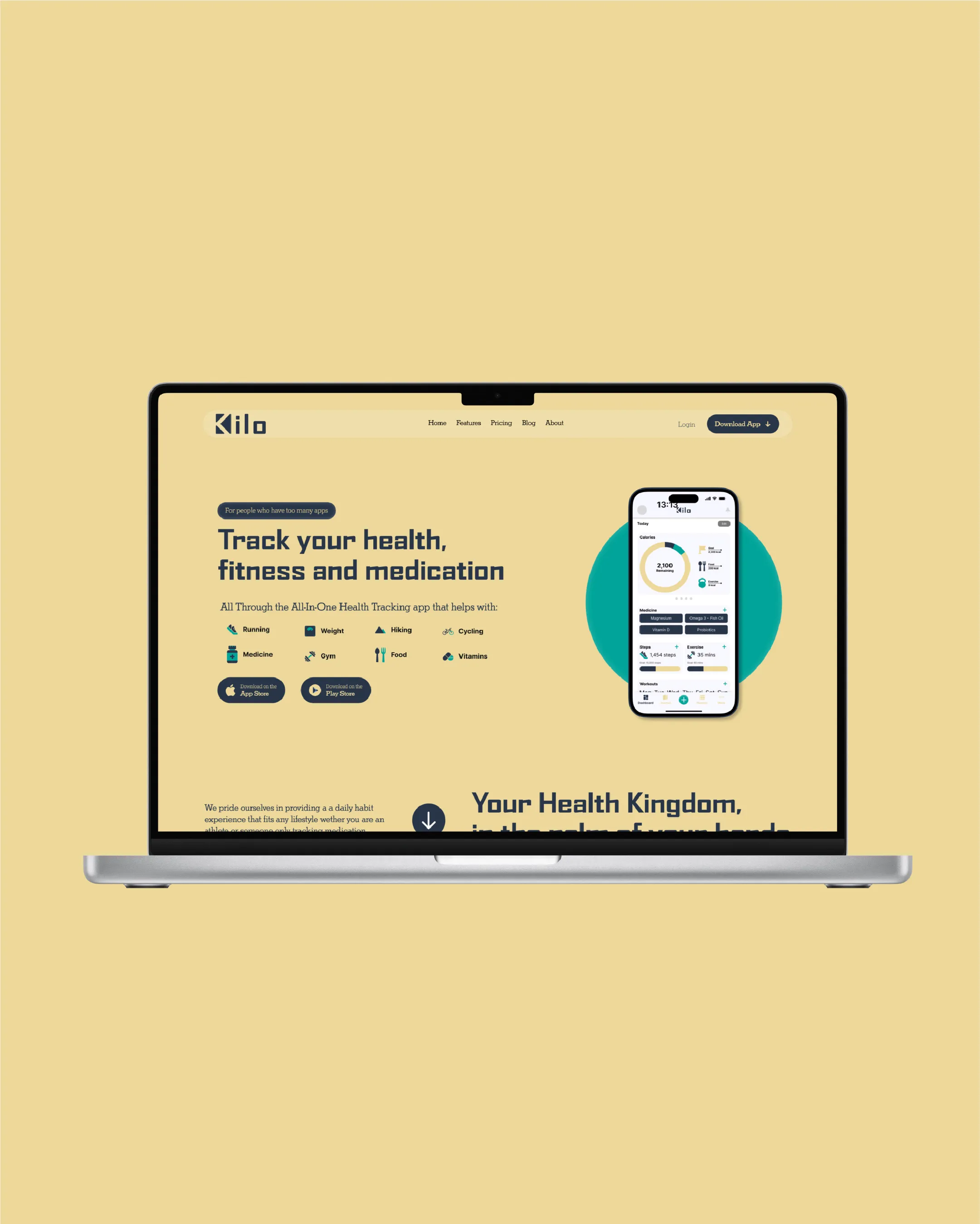
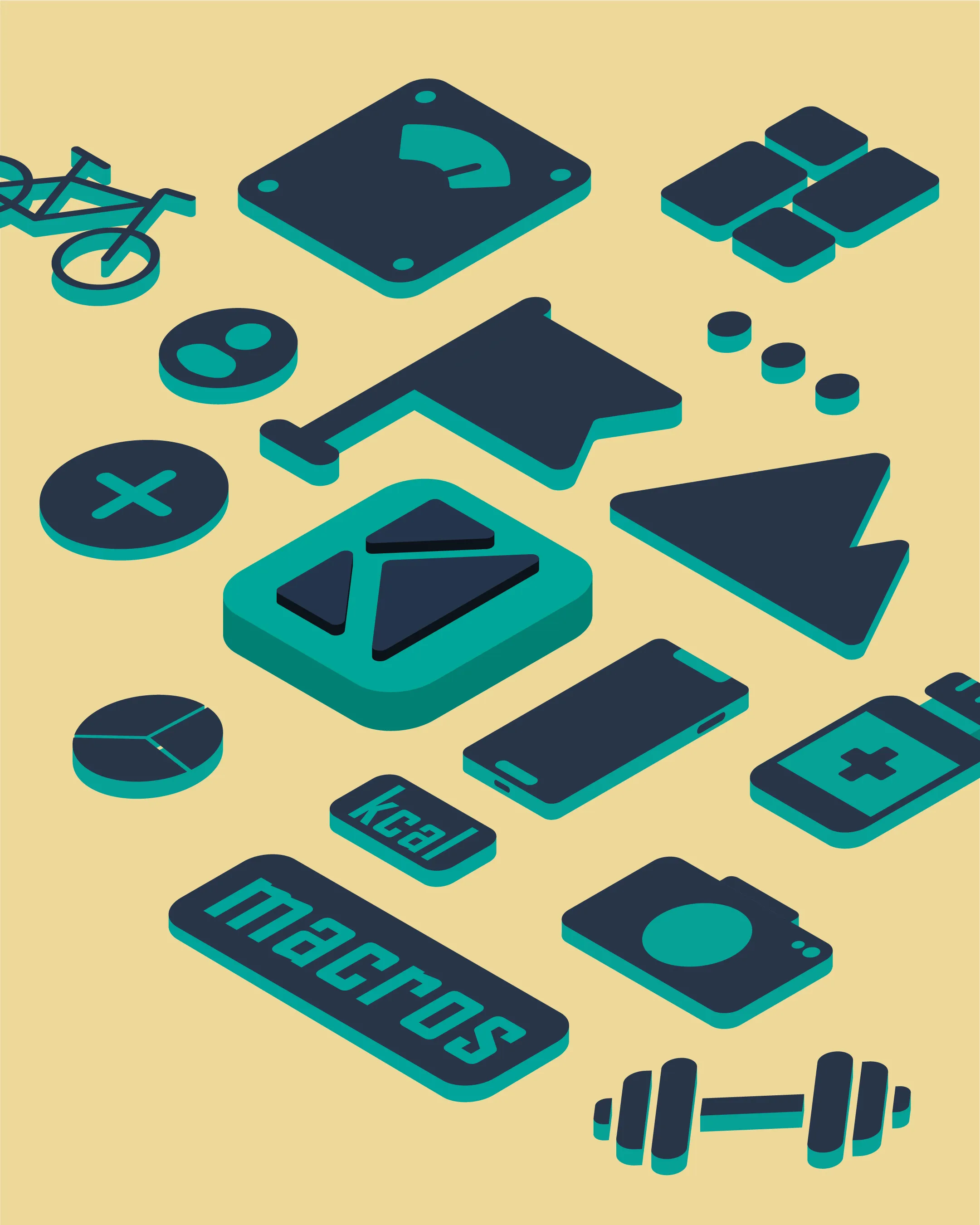
A K made from three triangles, a teal, navy and sand palette, and a set of isometric icons for everything Kilo tracks. The same pieces carry through the app screens, the landing page and the Instagram posts.
How I approached it
I started with the logo and the icons, because everything else in an app is built out of them. The triangles in the K come back in the icons and the little arrow on the social posts.
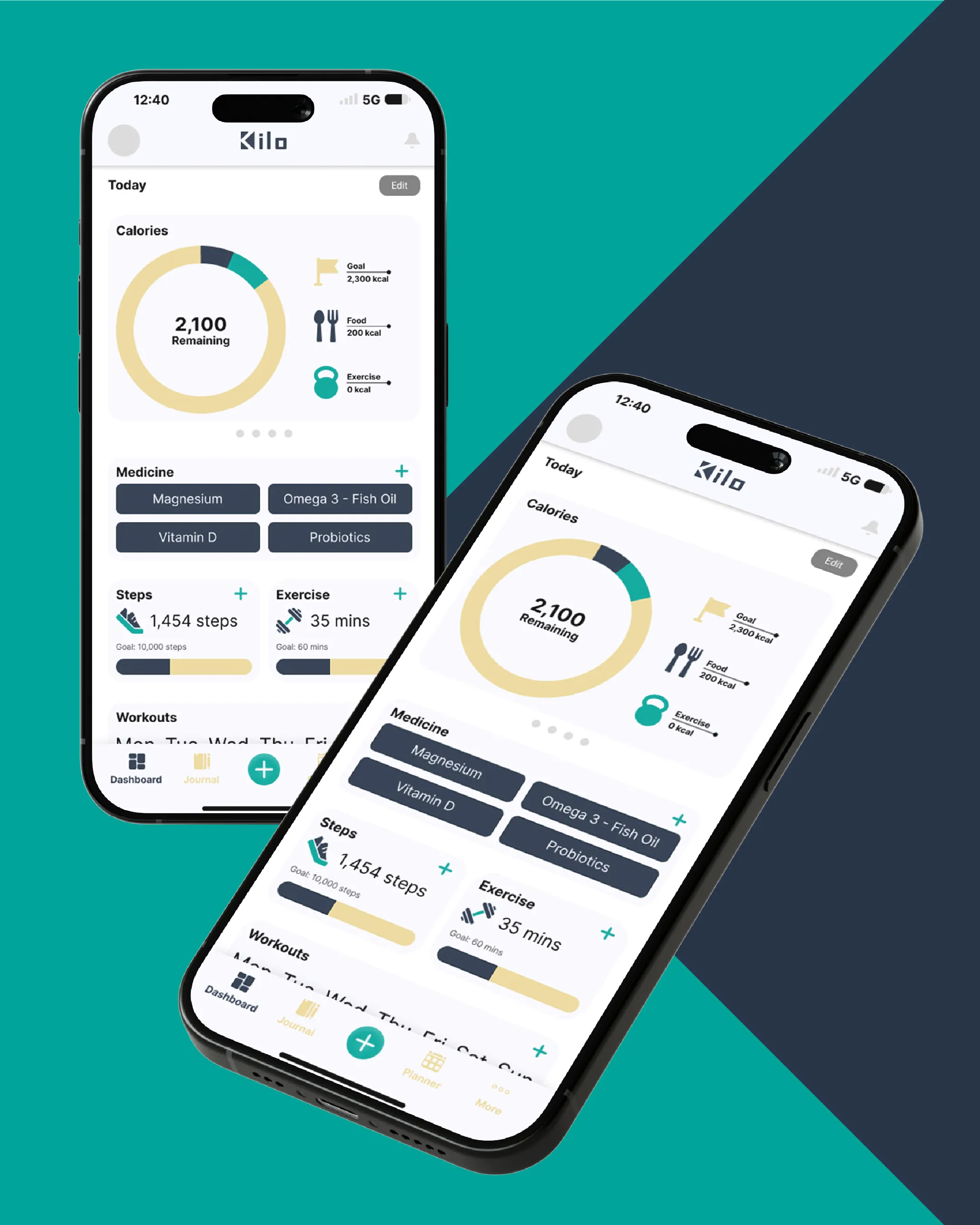
For the app I focused on the Today screen. If that’s clear, people open it every day. Each thing you track gets its own card, with one number that matters and a simple progress bar.
Want work like this for your business?