Yellow Bakery
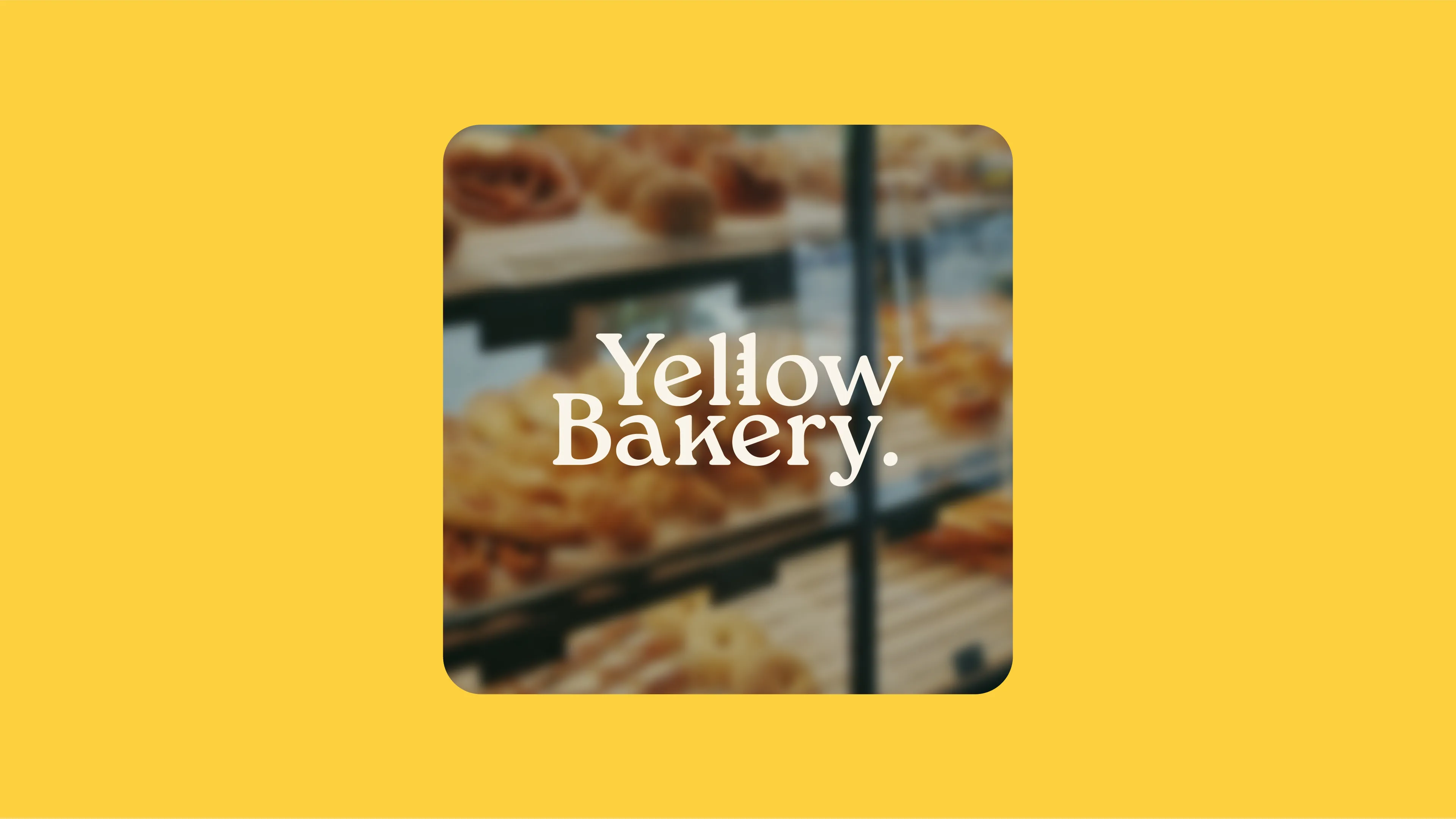
An identity for a neighbourhood bakery, built around a baguette hiding in the name.
The challenge
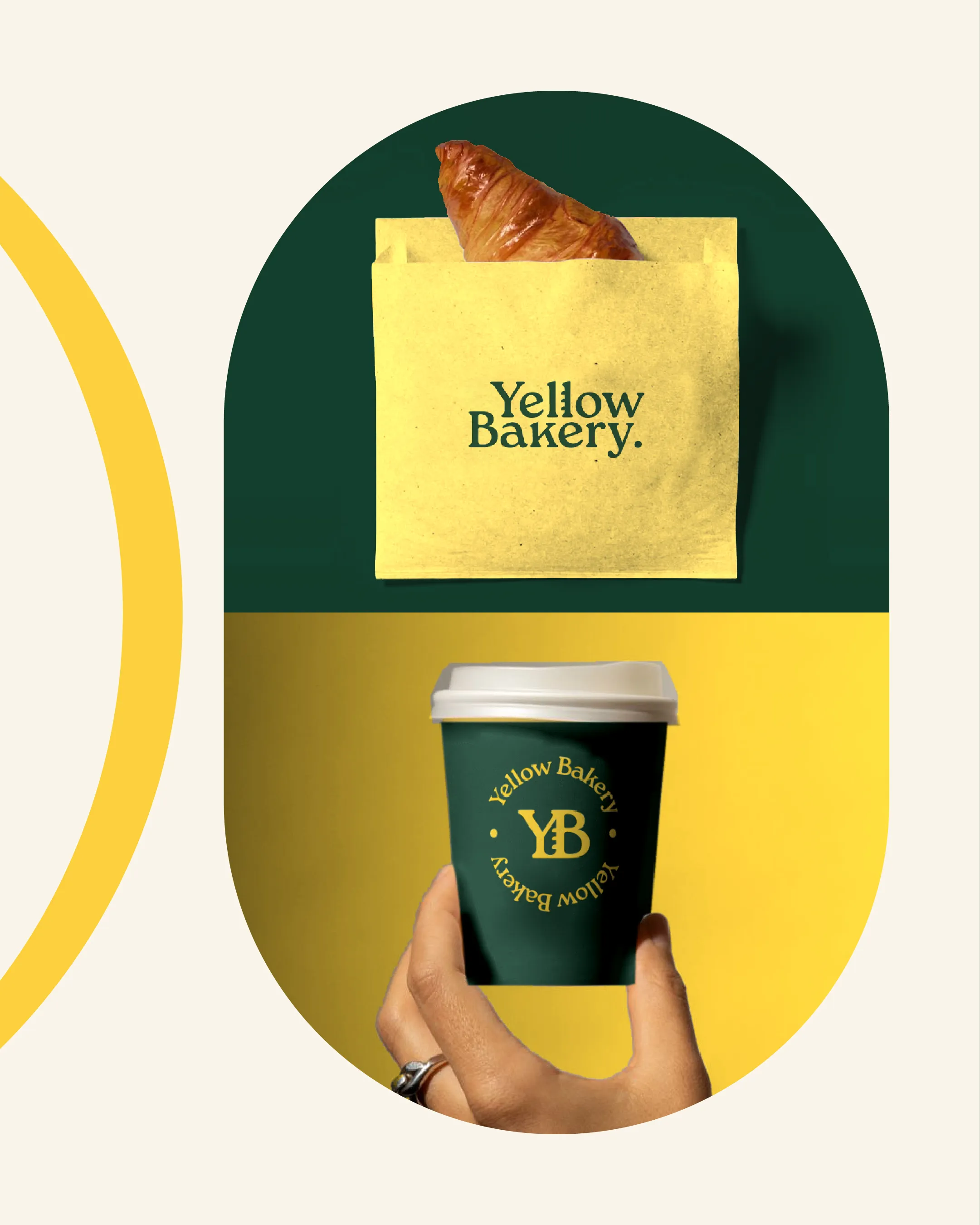
Yellow Bakery wanted a brand that felt warm and a bit old-school, like a bakery that's been on the corner for years. It also had to work tiny, on a coffee cup lid or a sticker on a paper bag.
The solution
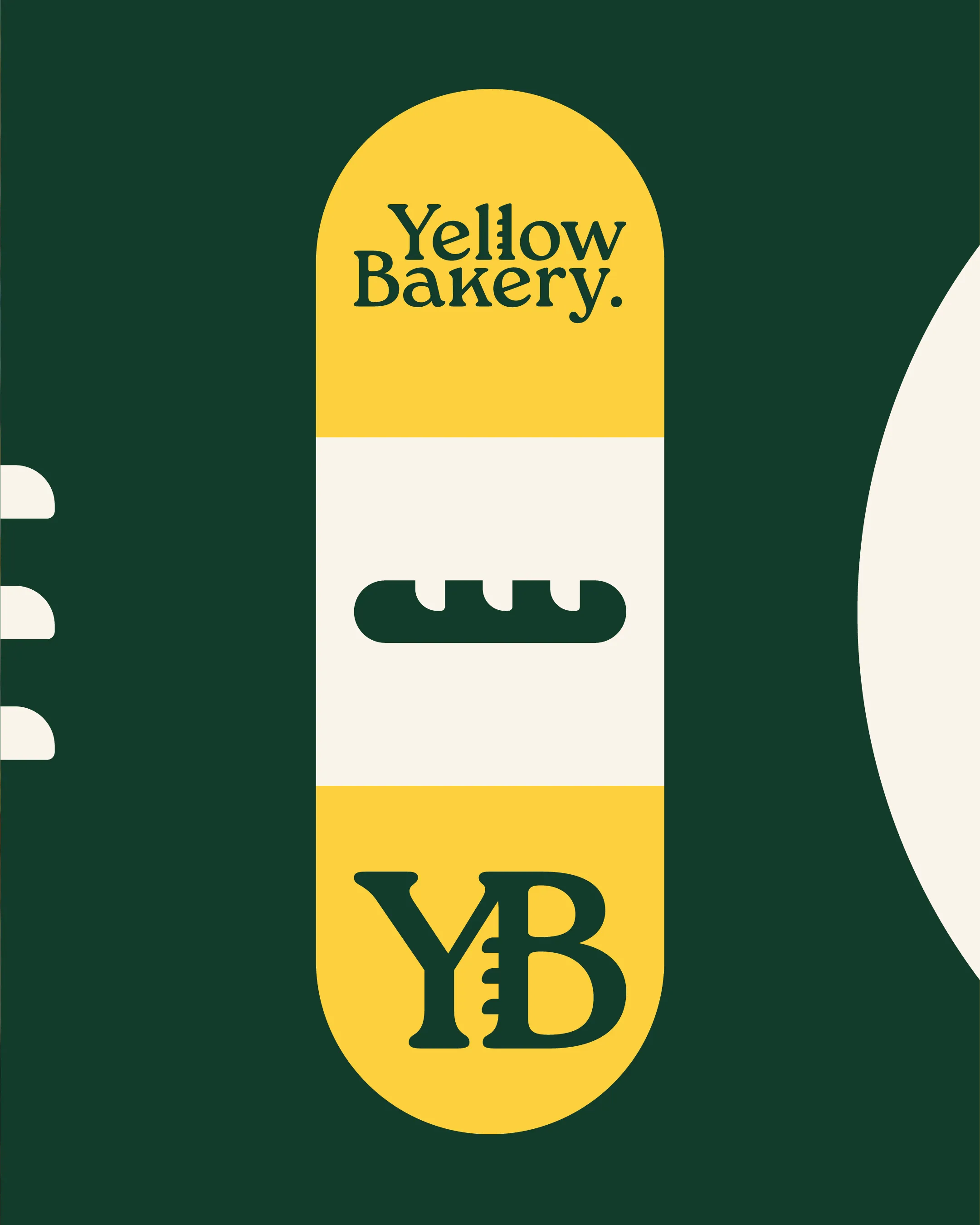
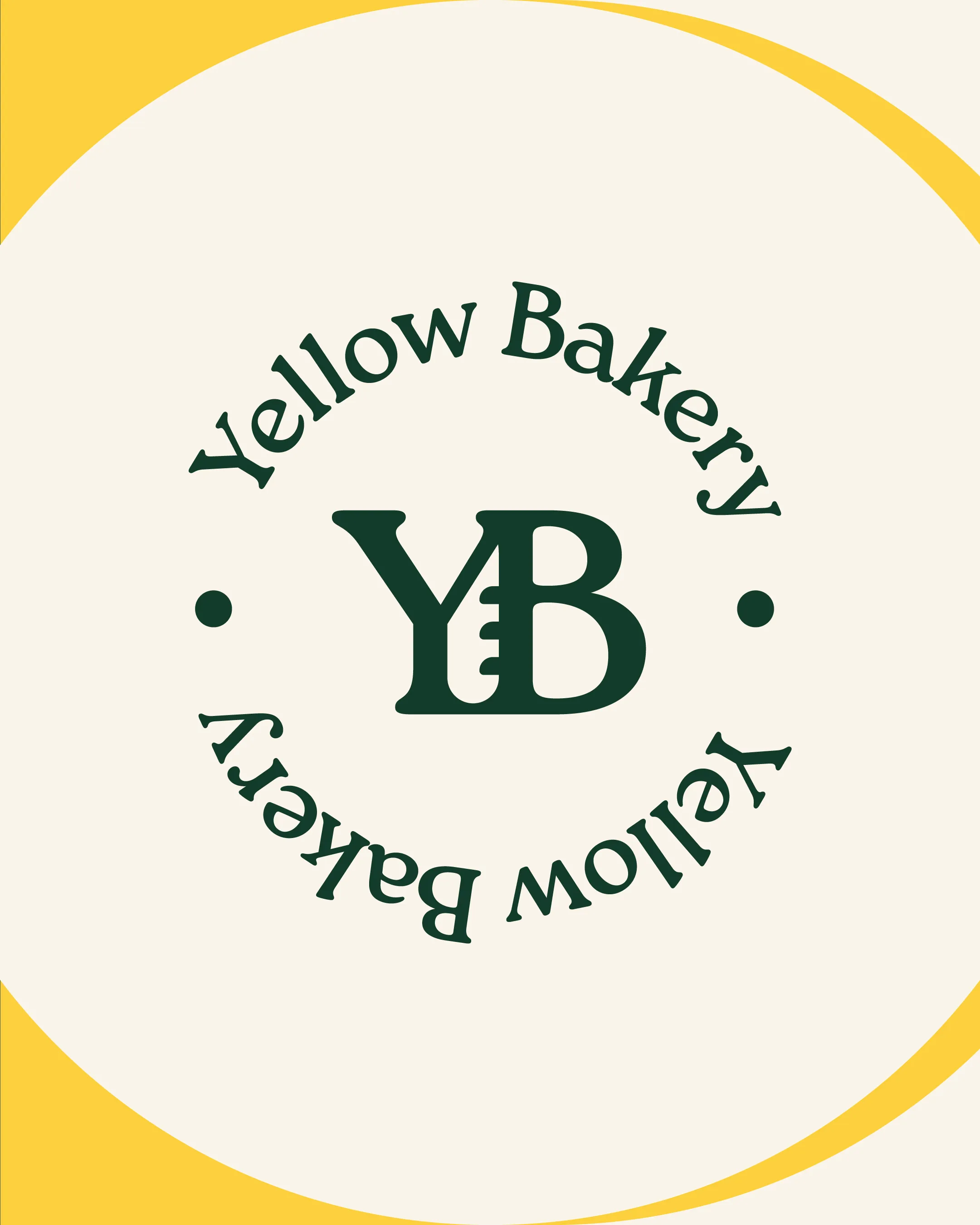
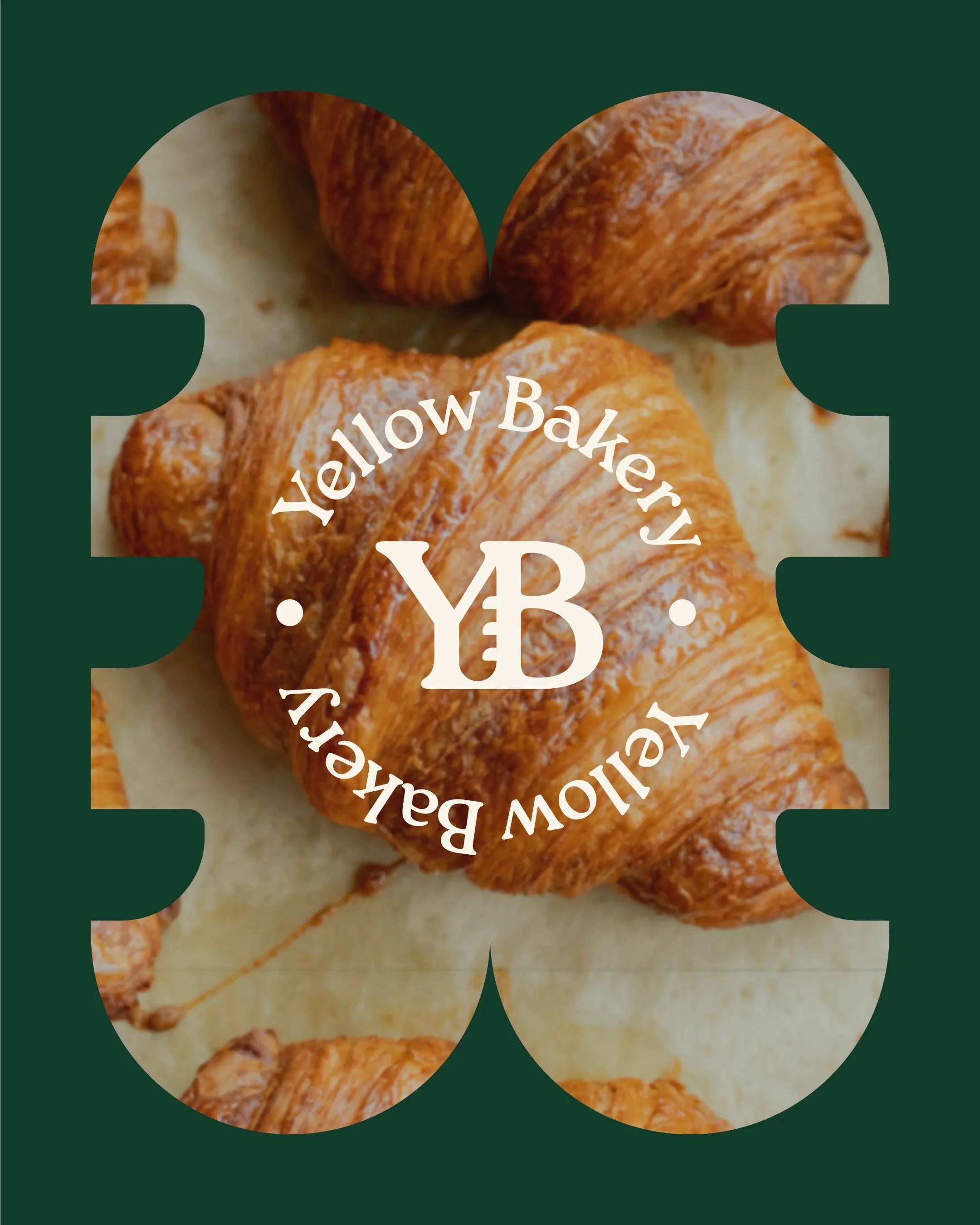
A serif wordmark with a baguette tucked into the first "l" of Yellow. The same detail carries into a YB monogram and a round badge for cups and stickers. Deep green and yellow, so it stands out on a counter full of brown bread.
How I approached it
The baguette in the “l” came out of the concepting stage. Once it was there, the rest followed: the monogram, the badge and the little bread icon all reuse it, so the brand works even when the full name doesn’t fit.
This was a proposal for a real bakery. They went a different way in the end, but I still think it’s one of my strongest identities, so it stays in the portfolio.
Want work like this for your business?